Scalable brands in the hospitality sector
Gorka Laucirica
Software Engineer
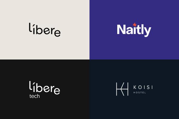
From the very beginning, as part of our scalable model to transform the concept of traditional accommodation, we had a clear vision of supporting multiple brands for a wide variety of buildings. Such a scalable approach requires implementing a homogeneous design across the brand.
Back in December 2020, Líbere was born as our first brand, being the Vitoria apart-hotel the first building of the chain. One year later, and with ten new openings, we closed the year with 11 operating buildings, distributed in 3 different brands.
With such rapid growth, agility becomes key to adapting our product to the business and inhabitants’ needs. As part of our building opening playbook, there is research on the brand that better fits the project, and sometimes, this means the creation of a new one.
Within all the operations carried out in Líbere Hospitality for the opening of a new asset is its adaptation to the brand. In the event that the typology varies in characteristics from the already existing brands, it is necessary to set up everything for the creation of a new brand. If this process is delayed, it could have a significant impact on the opening for sales, which takes place several weeks before the accommodation begins to receive the first inhabitants. Therefore we need to optimize the time to market of a new brand from the moment we receive the final result from the design agency.
After optimizing all the processes, so far, we need less than a day between receiving the final designs and opening for sales.

Offer a design according to the new brand in record time
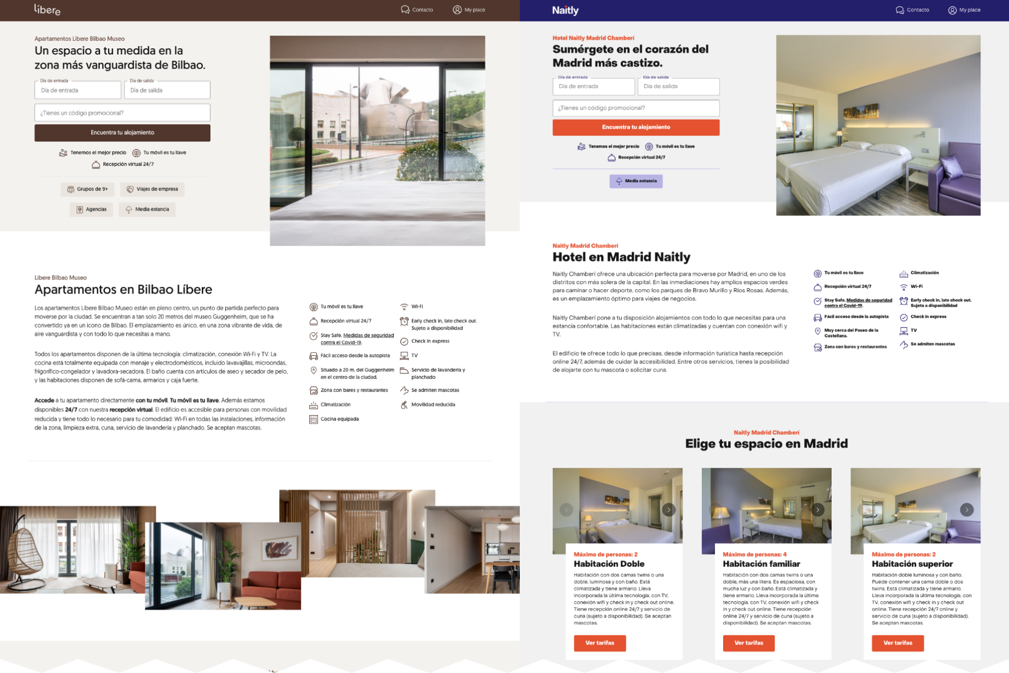
The biggest challenge is to keep the essence using generic templates and avoid dissipating the character of the brand while keeping a good pace on creating new ones. Moreover, adapting it to digital media and building signage (we’ll talk about this another day) makes it even more difficult.
We believe that by squeezing CSS to the fullest, together with a good content and image strategy, we could lay the foundations so that we would have everything ready in record time to start selling our apartments.
Tokenizing our style sheets to maximize flexibility
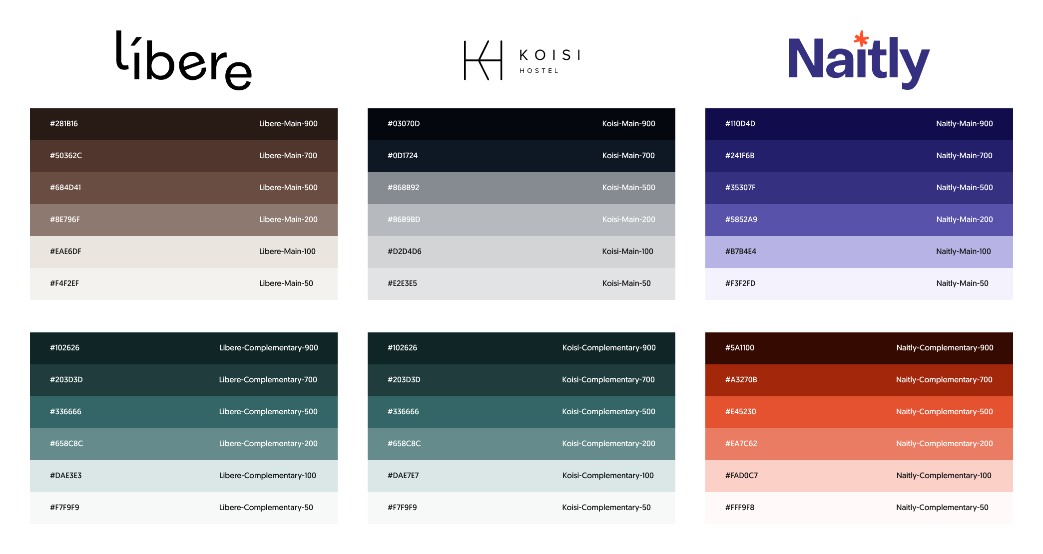
On the web and the app, within our base template, we have been including different extension points so that based on brand needs we can adjust the appearance in each case. On the web, we are currently handling about 50 CSS variables as "design tokens". We organize them into different groups:
- Color palette: The color palette is organized into three groups of colors and their variants. We call them main, complementary and gray. We keep the latter constant at the moment since it is used for the black scale. For the rest, we define 6 variants that help us adapt the medium to the brand.

- Typography: For typography, we usually have two different types, one for headers or headlines and another for the rest of the texts.
- Spacing: To preserve and guarantee fluidity between content, we have pre-assigned different tokens that help us have control over how space is managed at the level of each brand. The biggest challenge is usually found in fitting the typography that usually varies between brands and the spaces that it generates with the rest of the content. We usually find variance due to different line heights or details that the typography has.
- Component tokens: Components like buttons, lists, headers, or tables are tokenized to be fully customizable at the brand level.
For example, the CSS of a button in our design system looks like this:
.button {
  align-items: center;
  background: var(--color-button-background, var(--color-main-700));
  border: 2px solid var(--color-button-border-color, var(--color-button-background, var(--color-main-700)));
  border-radius: var(--border-radius-button);
  color: var(--color-button-text, var(--color-gray-000));
  cursor: pointer;
  display: inline-flex;
  font: var(--typography-label-m);
  justify-content: center;
  padding: var(--spacing-button, var(--spacing-03) var(--spacing-07));
  text-align: center;
  transition: background 0.3s, border-color 0.3s;
}
This enables all kinds of modifications over this styling. For example, our Naitly brand customizes the button background color with the following CSS:
:root {
	--color-button-background: var(--color-complementary-500);
	--color-button-background-hover: var(--color-complementary-200);
}
For those of you who are interested in the technical part behind this, we invite you to open the DevTools and inspect the site of any of our brands 😉
Content aligned with the spirit of the brand
On top of adjusting colors and typography, adapting contents, images and texts are essential too. There must be an alignment between the storytelling and what the brand represents. We rely on photography to align inhabitants’ expectations with the experience they are about to enjoy. Our brands must be consistent throughout the whole experience, and that includes decoration and interior design.
Furthermore, content management helps us to get closer to our target customers, describing as well as possible what they will find during their stay. All this is centralized in our content management system that enables the creation of pages with an intuitive page builder.
We are using a WordPress multi-site instance to manage and serve all the content used in our direct channel. In order to decouple the content management system (CMS) from our frontend clients, a GraphQL implementation was configured on top of WordPress. Using this approach, a very good time to market was achieved. We avoided reinventing the wheel at an early stage without compromising features using a widespread and battle-tested technology. All this without forgetting the long-term scalability, as the content is crawlable using REST or GraphQL APIs.
Transversal implementation of the brand
All of the above would not be possible if the brand concept was not present across the board in our systems. This step is usually one of the most critical and at the same time one of the most complex. By having the brand as a dimension of our buildings from day one, the whole system has been designed with this in mind, which makes horizontal scaling much easier, and facilitates data sharding in the future.
Our gateways are ready to identify a brand based on the public hostname. This information is mapped to all requests and is passed downstream to our private services. Additionally, with the help of our tooling, we are able to automatically generate metrics and alerts at a brand level.
Our buildings evolve and brands accompany them
A clear example of how the transversal brand implementation helps is the Naitly Madrid Chamberí Hotel. In September 2021, it was opened only 6 weeks after signing the lease with the owner of the building. In the coming weeks, we will begin with the reform that will increase the asset value, turning it into an apart-hotel. This building will be operated under the Líbere brand.
From the product team, we will accompany the rest of the teams in this transition process. For our part, we are already prepared thanks to the data structure that allows us to organize each asset by brand and operating chain. Only by changing its categorization, we will be migrating the existing reservations for the previous brand and we could start receiving new reservations in our direct channel as soon as this change is done.
More brands will come
It is undeniable that thanks to the rapid growth of our business, new types of accommodation will emerge that will require a new brand. To do this, we will continue to iterate on these solutions, making them even more flexible and configurable.
With technology in the center, we are pushing smart buildings and guest experience to the next level. Having automation and insights-driven as part of our DNA, we are building highly scalable and resilient systems to bring a unique experience to our guests.
If you like these challenges, you're in luck because we're hiring!